Archive for the ‘Design’ Category
For those of you who don’t know, Etsy is an on-line version of the local “arts and craft sale”. Think of eBay, but for handmade and hand-crafted items. It took awhile to get started in Medicine Hat, and even longer to get more than a couple people participating, but now there’s quite a few vendors locally.
There’s quite the range for Medicine Hat vendors too, anything from knitted caps, stuffed animals, plushies, weird and crazy jewelery (from Rapscallion Design), vintage clothing, greeting cards, original artwork, and more.
It seems Medicine Hat Media has been left out of the Visual Communications graduation show media release for the second year in a row. This is the last time we will advertise for them! Just kidding… or am I?
The exhibition for the graduation show is open daily between April 3-12 from 9:30AM and 4:30PM in the Medicine Hat College’s main lobby. The reception happens on Friday, April 9th, at 7:00PM, which coincides with The Children’s Hour that starts up at 7:30PM on the 9th.
I have received an invitation through my place of employment for the grad show, but it does not give too much information about what you can expect by attending the show. So judging by their website, reconcilehere.ca, it looks as though there are drawings, paintings, photographs, graphic design and perhaps sculptures.
The branding for the grad show is done again with a straight Helvetica type face. The website is a minimalistic WordPress theme, which unlike past years, allows everyone with access to the back-end of it to log in and upload their own photos. The website allows users to “Reconcile“, whereby the user can post any reconciliations they have, which will then automatically be posted to the website. I posted one:
I am a sad panda that this website was not submitted to http://www.medicinehatmedia.com to raise awareness for the reception!
-Sean
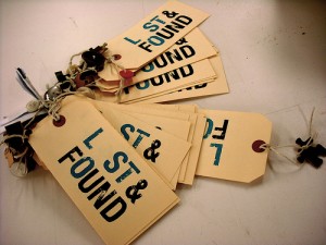
I hope this years graduation show is not advertised to be environmentally friendly, like last year’s Lost & Found show, whose organizers purchased huge amounts of corrugated cardboard to be connotative of the theme, which was probably just thrown out afterwards.
The reception should be host to food and alcoholic/non-alcoholic beverages, music and dancing. Come down, check some art, hear some music and get your fill of food. THE JUMP – Read the rest of this entry »
On my way out from the last film I saw at the Monarch, I was handed a business card with the statement, “Our new website is up with showtimes”. Which I thought was weird at the time since I have already used the “new” websites for viewing showtimes… but then as I wondered, I realized that, the website had not been updated in a while. I didn’t really think about it, until I was linked to themonarch.net which seemed weird. I didn’t remember it being a .network domain? Wait a second, what is this? It looked like the website took a step back in web design by 8 years. What’s with nothing lining up, what’s with the color scheme, why is there a tab-style menu not being used as tab-style navigation?
I was perturbed by this a bit, so I went to the Monarch’s twitter page (which also has not been updated in awhile), but it linked to themonarch.ca from there. Phew, the old site is actually still there. Wait a second… did I just get a new Twitter notification? @monarchmedhat is now following me. What? The Monarch is already following me… wait a second, this is a second Twitter account now, the original seemingly left behind just like the site, the original being @monarchtheatre.
When the re-brand was completed for The Monarch, I was a fan of the logo and color scheme presented on the site which showcased it in a consistent manner. It was definitely a throwback to many elements found in design in the 1950’s and even earlier which worked well with the idea/image of The Monarch. The website matched this aesthetic and as far as I know, Rapscallion Design was wholly responsible for the identity, branding, and web design. So what’s going on here exactly? I already have stated a little bit to why this is a huge step backwards for The Monarch brand, but let’s visualize it…
New site/old site
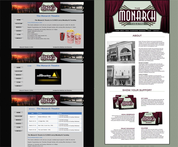
I didn’t post this solely for the reason of bashing the design, but I can’t understand why this would be happening? Say there was a falling out between two parties, you would expect the one party to release the website to them if they need it updated for themselves. They could take it and host it somewhere else and update it as they see fit. At the very least, there shouldn’t be two websites for the same business operating at the same time, let alone, two domains, two Twitter accounts, and next, maybe two Facebook fan pages?
Newly designed logo
Although I’m a tad bit late on this, TriCube Media, local web design and development company has released their new website a long with a new logo and branding effort. TriCube Media has also recently celebrated its fifth year running.
For those of you unaware, TriCube Media is The Medicine Hat New’s web department that branched out as its own company years ago and started servicing their own clients as well. TriCube Media also offers web advertising, company branding and other design related production. TriCube Media currently has offices and representatives in Medicine Hat, Lethbridge, Thunder Bay, and Kelowna.
The new website focuses on a clean and simple aesthetic with a bit of “corporate” feel to it (the stark white areas) offset by some colorful and bright backgrounds. The logo follows that same function but mixes “technology-esque” typography with a simple, yet iconic visual logo playing with the idea of illusion for introducing the “three cubes” as showcased in the intro video on the home page.
Some of you may know that I currently work for TriCube Media and was largely responsible for the outcome of the design and development on both the website and the new branding.
Sean has said that he wants to do a post or round-up of all the web design companies within the city, so make sure to stay tuned for that if you are interested in this kind of post. We will probably also feature each company separately at some point – kind of like this post, but more focused on the company itself rather than if it launched a new site.
Re-Design Tyme has launched their new website, which had its makeover from their older website that was designed by the late Mynista Studios. The redesigned site, which was designed and developed at Memory Lane Computers by myself, now features a more floral and vibrant design.
Local interior designer Leah Ebelher is the brains behind Re-Design Tyme. Ever wonder about redesigning your house? She definitely has the answers for you and can undoubtedly offer you many ideas to suit your desire. If you are skeptical, Re-Design Tyme has the mission to make their clients completely thrilled and they offer a guarantee that allows you to live in the redesigned space for up to 14 days. If you are not thrilled at the end of that time, they will return and keep working away until you are satisfied with no extra charge.
Even if you are not interested in a redesign yourself, but know someone who might be, Re-Design Tyme offers gift certificates.
Re-Design Tyme website is no longer online.
Medicine Hat Media was first came into realization after many days of wondering what to name ourselves in an ongoing discussion between Sean and myself. We eventually settled on “Medicine Hat Media” – it just had a good ring to it, plus it fit our vision of what the site would be. Unknowingly for us, “Medicine Hat Media” was a a physical company before we snagged the .com domain in 2008.
Looking back, we actually already suspected that this domain was being used for some purpose before because we were getting link backs from other Medicine Hat sites that attributed us (or the Medicine Hat Media before us) to website design and development. Through the Internet Archive Wayback Machine, I was able to take a look at what existed before in two entries:
November 20th, 2004
February 13th, 2005
From what we are able to see (from the portions of the site that still work) it was a graphic and web design company with a team made up of Mike Helton, James Robertson, and Niko Poulopoulos. Where they went or what they did after is a mystery! Judging from their earliest archived site, it seems like they might have been around longer than 2004 too, since they refer to that site as version 2.0. Comment if you have any stories or know anything else about the previous Medicine Hat Media.
Please first view our news post about Lost & Found.
In brief: the Medicine Hat College’s Visual Communications grad show will be held tonight starting at 7PM. There will be a variety items in the exhibition including art, design, furniture, video, photography and more. There will be entertainment, food, and most likely some alcohol beverages. It will be held in the main Medicine Hat College entrance – it will be hard to miss.
This is the first post I’ve done of this kind on Medicine Hat Media. Small tweaks and changes over the sites short history were always just done and never commented about. The changes done in this case are more important – or important enough to do a post about.
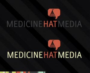
Logo
Somebody recently asked us for our logo which made us come under the realization that our “logo” was more of just a site header rather than a traditional logo-type that could be used in multiple applications. Which really was bad considering I never do that for any of my projects and I did graduate from the Visual Communication program after all. I was also never satisfied with what I created in the first place – it was just too busy and meaningless for the sites function.
Although I’m traditionally opposed to using the “tipi” imagery since it’s so cliche; I think it speaks more about our site than anything else ever could. I also wanted to add things like “art” and “music” symbolism into the logo but was too busy and maybe was too specific anyways since this site ranges topics a lot more now than it did in the past. So more than anything, this site is about commenting about Medicine Hat – the reference that the speech bubble with the tipi conveys.
THE JUMP – Read the rest of this entry »
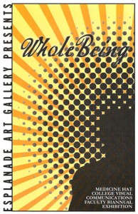
Starting December 16, 2008, at the Esplanade Arts & Heritage Centre, begins Whole Being, the biannual faculty exhibition from the staff of the Medicine Hat College Visual Communications program. The program of which is founded from the collaboration between fine art and design. The staff consists of a world-wide variety of skilled artisans, all specialized in their own way. Whole Being includes the professionals, Laara Cassells, Craig Cote, Deborah Forbes, Mato Higashitani, Rory Mahony, Micheal McClary, Poul Nielsen, Dean Smale, Yulin Wang, Giles Woodward, and Nelson Yuen. Poul Nielsen has also recently been a featured artist here at Medicine Hat Media; he specializes in drawing and painting. With all types of media combined, the show is surely to strike at all the senses, as well as instill deep thought about how we relate to the world in which we live.
The reception begins Thursday, January 22, 8PM, and is also free admission. The show ends February 1, 2009, making it the grand show to carry the Esplanade into the 2009 New Year. Here is the summary statement presented to you by the Esplanade:
“Artists and designers from the faculty of the Visual Communications Program at Medicine Hat College show exciting new works in all media which embrace art as a way of making sense (by every means) of the existing world and our place in it.”
Rapscallion Design is a Medicine Hat-based graphic design company.
The company has been in business for years now, producing designs that range from clothing to websites.
Rapscallion Design sports an in-house screenprinting service which they utilize as all their retail designs are created by hand and screenprinted by hand. Mass production is cool and all, but it is definitely an added bonus to feel that you are not a product of mass production and to support the arts. Their designs are not done by a bunch of kids who pirated the Adobe Creative Suite and learned how to trace in it, but totally opposite, the workers at Rapscallion Design have their degrees in Visual Communications, and after being in the industry for a number of years, can really produce some awesome work.
You can check out the store at 455 3rd Street SE, Downtown Medicine Hat.
You are currently browsing the archives for the Design category.

