Posts Tagged ‘Website Design’
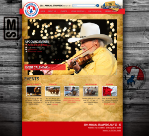
The Medicine Hat Exhibition & Stampede has just recently got a much-needed face-lift on their old site. Although the old website gave visitors what they needed, it was hard to navigate and confusing to find specific things. The new build, developed and designed by TriCube Media boasts a much stronger western feel but keeping true to the red and blue of the known brand. It features all the same content, but a larger focus on photography and events. As this is the slow season for the Medicine Hat Exhibition & Stampede workers, I would expect a lot more content to show up on the site over the next month(s).
Also, as you may have noticed, Jim Tennant, Corp. Develp. Mktg. of the Medicine Hat Exhibition & Stampede has started to post on Medicine Hat Media, which is awesome by the way.
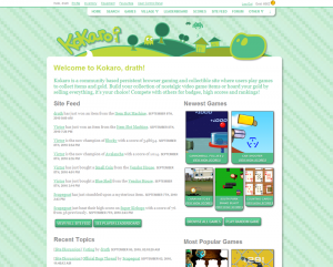 While my latest project isn’t exactly local-centric, it is a local website, developed and designed by myself (with some help from Dusty Melling) with lots of members from Medicine Hat. It is a persistent browser based gaming site within a gaming site – kind of like an interactive mini game site where you play flash-based games to get gold, video game items, and badges from competing with other players for high scores. It also is a collectible site where you collect these nostalgic video game items to get a full set, enchant them, equip them, trade them, sell them, buy them among other interactions.
It’s a site that is in constant development with new things happening all the time. It has been up for awhile now, but only recently have I made some changes to make it more of a complete experience for newly registered users. Try it out and register!
There’s a lot of new Medicine Hat websites coming out these days. A sign that Medicine Hat might be embracing the times? Either way, it doesn’t really apply to Moving and Choosing, an initiative of “Be fit for Life” and Alberta Health Services because they have had a website for a long number of years already. This post is about their new one which focuses on an updated design, branding effort and other optimizations of the sites content and focus.
The Moving and Choosing website has five main sections:
- The home page – where you can see new things happening on the site and within the program. The “What’s New” section is updated regularly and features updates to the site and other related resources.
- Healthy Eating – A section dedicated to healthy eating articles, tips, and an events calendar that lets you know about any healthy eating meetings, talks, presentations and more.
- Active Living – Active Living recognizes the joys, values, & benefits of all types of activities. About staying active and getting in shape.
- School Community – Definitely the largest section. Once you enter it, you will get access to a drop-down menu which features the bulk of the sites content: teaching resources, teacher profiles, submission forms, success stories, parent council, newsletters and more.
- Tobacco Free – Tobacco use is the leading cause of preventable disease and death in Canada and most other developed countries. This section features some resources on being “tobacco free”.
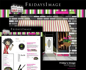
Coming out of TriCube Media, is the Friday’s Image website. A local, visually artistic site, for the popular downtown lingerie and cosmetics store. Recently added to the site was the ability to purchase cosmetics online, truly making it an e-commerce website. Owner, Diane Ziegenhagel states that she still wants women to come into the store for lingerie purchases to receive their premium fitting services as detailed in the “Fitting” article – but the website still allows women (and I guess, Men buying for women?) to browse through most of their inventory.
Each section of products features a custom digital illustration to match the product, done by local artist (and sometimes Medicine Hat Media poster), Dusty Melling. All of the cosmetics imagery has also been digital drawn and vectored to match the overall aesthetics of the site. The color palette is vibrant and fun – suiting the personality of Dianne and the branding of the store.
This post for me kind of goes outside of my knowledge in terms of the content on the website (you know, being a guy and all), but being a part of the actual website development granted me an opportunity to get to know Dianne and her store, I thought it would be nice to shed some light on this beautiful local website, not matter how bias I may seem.
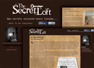
The Secret Loft is a new website and project launched by local, Joleen Gavey and released on Tuesday March 16th. The locally unique website presents original, diverse short fiction stories. The stories are broken up into chapters and released separately so you only read a chapter per each book update – That is of course if you start from the time the first chapter is released. The idea reminds me a bit of episodic content which has been proven to be successful in mediums like video games and television.
The site is designed and developed by husband, Derek Gavey. Upon launch, the first chapter of “In My Solitude” was released.
A little bit more about Joleen:
I only started writing fiction about a year ago. It’s kind of a new thing. I say “kind of”, because I’ve always written things down, scribbled on scraps of paper, in notebooks.
The stories featured in the Secret Loft are about other people. Most of them are people I’ve never met. All of these people have their own secrets, but they also have some stories to share. So, this website is dedicated to presenting them in an accessible, beautiful way. It has already been a very interesting process. I hope that the stories prove a worthwhile diversion from reality; no one should have to spend too much time there.
On my way out from the last film I saw at the Monarch, I was handed a business card with the statement, “Our new website is up with showtimes”. Which I thought was weird at the time since I have already used the “new” websites for viewing showtimes… but then as I wondered, I realized that, the website had not been updated in a while. I didn’t really think about it, until I was linked to themonarch.net which seemed weird. I didn’t remember it being a .network domain? Wait a second, what is this? It looked like the website took a step back in web design by 8 years. What’s with nothing lining up, what’s with the color scheme, why is there a tab-style menu not being used as tab-style navigation?
I was perturbed by this a bit, so I went to the Monarch’s twitter page (which also has not been updated in awhile), but it linked to themonarch.ca from there. Phew, the old site is actually still there. Wait a second… did I just get a new Twitter notification? @monarchmedhat is now following me. What? The Monarch is already following me… wait a second, this is a second Twitter account now, the original seemingly left behind just like the site, the original being @monarchtheatre.
When the re-brand was completed for The Monarch, I was a fan of the logo and color scheme presented on the site which showcased it in a consistent manner. It was definitely a throwback to many elements found in design in the 1950’s and even earlier which worked well with the idea/image of The Monarch. The website matched this aesthetic and as far as I know, Rapscallion Design was wholly responsible for the identity, branding, and web design. So what’s going on here exactly? I already have stated a little bit to why this is a huge step backwards for The Monarch brand, but let’s visualize it…
New site/old site
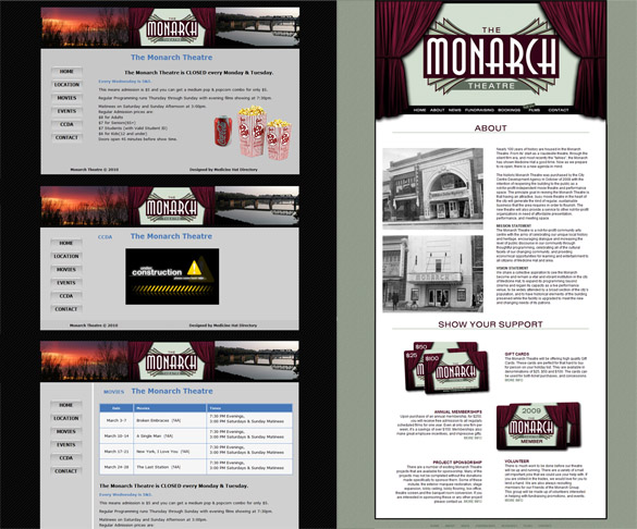
I didn’t post this solely for the reason of bashing the design, but I can’t understand why this would be happening? Say there was a falling out between two parties, you would expect the one party to release the website to them if they need it updated for themselves. They could take it and host it somewhere else and update it as they see fit. At the very least, there shouldn’t be two websites for the same business operating at the same time, let alone, two domains, two Twitter accounts, and next, maybe two Facebook fan pages?
Lately, I’ve been trying to get around to featuring all the new local websites that have been popping up lately, but it’s really hard writing about all of them on a weekly basis now. It almost seems like around 2 or 3 of them pop up per week – I guess I am not helping the situation either, as it’s part of my profession, haha.
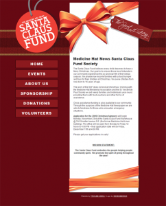
This week we have a new website for the Medicine Hat News Santa Claus Fund (Society). The logo was designed by local design studio, December 2nd, while the website was created and designed by TriCube Media for a Medicine Hat News organization. It’s great when three local companies can come together and develop something; albeit, TriCube Media and Medicine Hat News were already working together. The website URL has also changed over to “mhsantafund” rather than the obscure “mhscf”.
A great section of the site is the event section which is a huge list of events taking place as part of the Santa Claus Fund. The 17 or so events are all happening from July to December and most of them are recurring yearly. Hopefully we can even post a couple of them on Medicine Hat Media when they are near. There was a full story about the make-over posted in the Medicine Hat News today.
All information about the organization can be found on the new website.
Newly designed logo
Although I’m a tad bit late on this, TriCube Media, local web design and development company has released their new website a long with a new logo and branding effort. TriCube Media has also recently celebrated its fifth year running.
For those of you unaware, TriCube Media is The Medicine Hat New’s web department that branched out as its own company years ago and started servicing their own clients as well. TriCube Media also offers web advertising, company branding and other design related production. TriCube Media currently has offices and representatives in Medicine Hat, Lethbridge, Thunder Bay, and Kelowna.
The new website focuses on a clean and simple aesthetic with a bit of “corporate” feel to it (the stark white areas) offset by some colorful and bright backgrounds. The logo follows that same function but mixes “technology-esque” typography with a simple, yet iconic visual logo playing with the idea of illusion for introducing the “three cubes” as showcased in the intro video on the home page.
Some of you may know that I currently work for TriCube Media and was largely responsible for the outcome of the design and development on both the website and the new branding.
Sean has said that he wants to do a post or round-up of all the web design companies within the city, so make sure to stay tuned for that if you are interested in this kind of post. We will probably also feature each company separately at some point – kind of like this post, but more focused on the company itself rather than if it launched a new site.
Medicine Hat Media was first came into realization after many days of wondering what to name ourselves in an ongoing discussion between Sean and myself. We eventually settled on “Medicine Hat Media” – it just had a good ring to it, plus it fit our vision of what the site would be. Unknowingly for us, “Medicine Hat Media” was a a physical company before we snagged the .com domain in 2008.
Looking back, we actually already suspected that this domain was being used for some purpose before because we were getting link backs from other Medicine Hat sites that attributed us (or the Medicine Hat Media before us) to website design and development. Through the Internet Archive Wayback Machine, I was able to take a look at what existed before in two entries:
November 20th, 2004
February 13th, 2005
From what we are able to see (from the portions of the site that still work) it was a graphic and web design company with a team made up of Mike Helton, James Robertson, and Niko Poulopoulos. Where they went or what they did after is a mystery! Judging from their earliest archived site, it seems like they might have been around longer than 2004 too, since they refer to that site as version 2.0. Comment if you have any stories or know anything else about the previous Medicine Hat Media.
Rapscallion Design is a Medicine Hat-based graphic design company.
The company has been in business for years now, producing designs that range from clothing to websites.
Rapscallion Design sports an in-house screenprinting service which they utilize as all their retail designs are created by hand and screenprinted by hand. Mass production is cool and all, but it is definitely an added bonus to feel that you are not a product of mass production and to support the arts. Their designs are not done by a bunch of kids who pirated the Adobe Creative Suite and learned how to trace in it, but totally opposite, the workers at Rapscallion Design have their degrees in Visual Communications, and after being in the industry for a number of years, can really produce some awesome work.
You can check out the store at 455 3rd Street SE, Downtown Medicine Hat.

