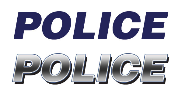
Police Service – New Car Decals
I felt myself obliged to weight in as the Medicine Hat Police Service website issued a new poll and article on their site entitled “New Car Decals” with a vote/poll on the new design. While I was strongly wanted to vote “no” instinctively to the whole thing, I felt it in the best interest to issue my opinion in a less “black or white/yes or no” type fashion. To clarify though, I’m not necessarily saying the design and branding is bad or anything subjective like that, rather just bringing up a question about designing for differentiation. To begin, I offer the following comparison in branding and design aesthetic.
Which version of “Police” actually says Police or law enforcement/something important to you:

This town, like a lot others, are filled with businesses and companies doing complete decal and vehicle coverings to promote their business, full of gradients, text effects, backgrounds, photography and whatever else is relevant or (in most cases) irrelevant to their companies. You’ve probably seen the car dealership vehicles driving around city with complete decal coverings advertising themselves. Most cities have keyed into this and designed their Police cars accordingly, using the same typeface treatment as well as colour usage as they have always used to promote recognition but also to signify they are “different”. While most consider the aesthetic boring or “dated”, it works, in a visual communication point of view. Consider this next example:

Obviously I’m stretching a bit here, but my logic, I think, is intact. A lot of the recognition is intrinsic to the car make and model, but, I like to think, in the field that I work in, that design accounts for at least, something. Anyways, what do you think?
http://www.medicinehatpolice.com/feature-new-car-decals.html

January 23rd, 2010 at 2:00 PM
April says:
Totally agree – it needs to be read quickly, often under poor lighting conditions and without all the gradient trendy fluff imho.
January 23rd, 2010 at 2:48 PM
jace anderson says:
Either way, be sure to vote. Feedback is important… and no doubt appreciated.
/i’d like your blue ‘POLICE’ more if you gave it the white outline and the black drop shadow. Just sayin’
January 23rd, 2010 at 3:41 PM
Richard Hobson says:
I voted on the side of readability. While it’s hard to make a police car not look like a police car, the current design idea looks driven by aesthetics not function. And in the case of our law enforcement I prefer function over form.
The flat blue “POLICE” is much more instantly recognizable in function. The gradient while purdy and in many ways nicer; looses a lot of that.
The drop shadow is beneficial for increasing the contrast, but it’s not enough to counterbalance the gradient.
Maybe they could try keeping the drop shadow and maybe even the outlining to some degree, but the gradient should go.
O.
January 23rd, 2010 at 4:10 PM
Vaughn says:
I would also like to note that I’m not criticizing the branding or design of the new decals necessarily, rather just bringing up a point or question about designing for differentiation.
January 24th, 2010 at 12:21 PM
Justin says:
If you are going to run an organization where you call yourselves lieutenants and sergeants why ‘market’ yourself like every other trendy business? How can they be taken seriously pulling up to a crime scene with a car dressed up like the My96 Hummer (for example).
While I agree with maybe having a car or two in the fleet for parades or special functions that are done up with enhanced graphics, the basic cars should reflect a strong, traditional, no nonsense approach.
January 26th, 2010 at 9:59 AM
Dusty says:
My96 Hummer? I just lost any remaining respect for My96 that I had.
January 26th, 2010 at 5:57 PM
Sean says:
Silver/black/white gradients and drop shadows are totally the future of law enforcement. You should have used the actual picture of the logo from the site, Von. The letters in Police are so mashed together that it is even less legible, looks more like “POUCE”. Police chief’s kid probably mocked it up in GIMP.
Dusty – Every “today’s best music” targeted radio station has a Hummer. I remember in high school in Regina, there would be a radio station hummer outside sometimes with speakers on top of it playing bad music and the DJ’s would shout “come on over and win prizes”, to which I had no interest because they played the same boring music every day. Bias, of course.